“A Smart Food Application Designed to Let Customers Order Effortlessly When Waiters Are Busy, While Giving Small Restaurant Managers Tools to Efficiently Run and Monitor Their Operations.”

Project Overview
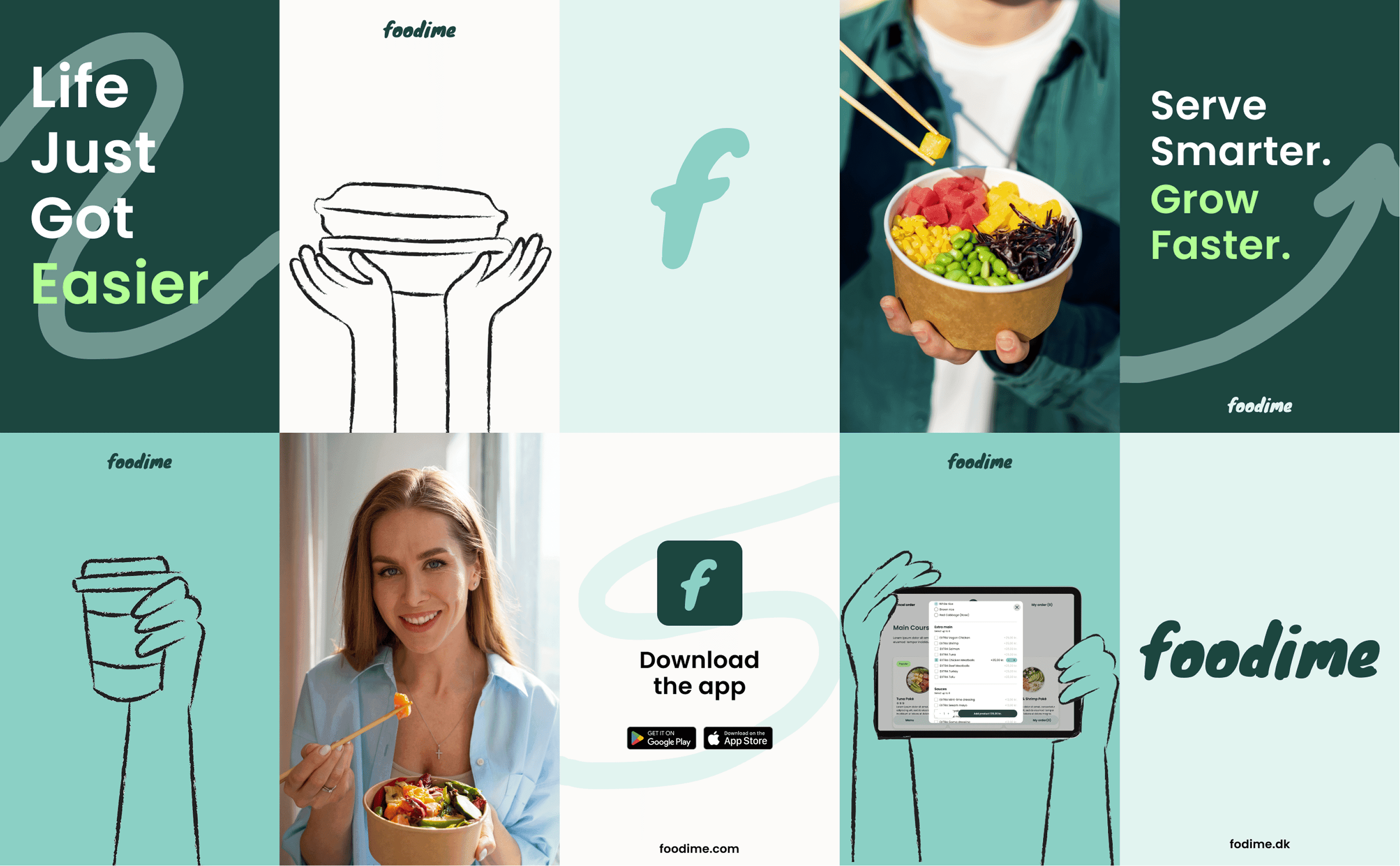
During my internship, I was tasked with redesigning the Foodime app — a self-ordering and point-of-sale (POS) system tailored for small restaurants, cafés, and pizza shops. The goal of the redesign was to enhance the overall user experience, streamline the ordering process, and improve interface clarity for both customers and restaurant staff.
What is Foodime ?
Foodime (pronounced /fuːd ɪ mi/) is a digital self-service platform that eliminates the need for customers to queue or wait for a server. Placed on an iPad inside the restaurant, the app allows customers to:
Browse the menu 🍔🥗
Customize their meals 🧂
Place orders without waiting 🕒
Pay instantly using MobilePay or QR codes 💸📲
The order is sent directly to the kitchen, helping staff serve more efficiently and reducing human error.
On the backend, Foodime offers:
A clean order dashboard 📋
An admin panel for tracking sales across multiple locations 📊
Project Duration
3
Month
XIIA
Company
Product Designer
My Role
+40
Screens
Android
Platform
Who i am solving for ?
👨🍳 Primary: In-store customers wanting a fast, contact-free order experience
🧾 Secondary: Restaurant staff managing and tracking orders
What problem am i solving ?
Based on the initial audit and stakeholder conversations, I categorized assumptions into validated and unproved ones. This helped me prioritize what needed further user testing.
What are my design goals?
Manager-Side Goals
Design a clear dashboard to view and manage active and recent orders.
Add a payment detail view for tracking different payment statuses.
Modernize the interface for updating restaurant and account information.
Improve the staff invitation flow and simplify setting up employee accounts.
Make it easier to add menu categories, food extras, and customize offerings.
Introduce tools to create and manage promotional coupons.
Build a staff dashboard to provide real-time kitchen and team status updates.
Customer-Side Goals
Simplify the food menu layout and improve category navigation.
Add an order summary page before final checkout to reduce confusion.
Introduce clear pop-up confirmations for important user actions (like placing an order).
Make payment options (MobilePay, NFC, etc.) more understandable and user-friendly.
Allow users to choose a preferred pickup time for takeaway orders.
Create dedicated feedback pages for different payment states (e.g., success, failure).
How can i better understand our users?
Understanding how, what, and when users interact with Foodemi revealed key pain points in the experience.

What should My MVP include to deliver the most impact?
I distilled my design goals into an MVP, focusing on the essential features that provide the greatest value for customers, managers, and staff while ensuring a smooth ordering and management experience.
🍽️ How might we make ordering and checkout seamless and clear for customers?
📊 How might we give managers efficient tools to track orders and manage staff?
👩🍳 How might we enable staff to easily manage menus, orders, and promotions?
What flows are missing in the user journey?
Before jumping into sketches, I began by mapping out the user journeys to identify what flows were already in place and more importantly, what steps were missing. This helped me uncover gaps in both the customer and manager experiences.
Customer View


Manager View


Employee View


What did I transform from old to new?
Before starting the redesign of each section of my tasks, I researched similar apps to gather inspiration and keep ideas in front of me. Based on the feedback and identified pain points, I refined and updated the design to create a more effective solution.


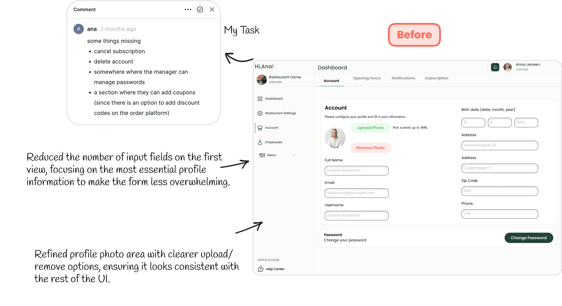

Led +40 pages...
How can I ensure every user flow feels seamless from start to finish?
After completing the sketches, I re-prototyped all pages in Figma — connecting every interaction across Manager, Staff, and Customer views. This allowed me to test navigation, identify dead ends, and refine transitions to make the entire experience smooth and intuitive for all user roles.

Did I solve the problems?
To evaluate if the new Foodemi redesign improved the ordering experience, we ran a quick user test. We gave participants a 5-second view of key screens and then asked:
Did the redesign make Foodime faster, clearer, and more enjoyable to use?
Users responded positively to the new navigation, category icons, and simplified ordering process. They felt the app was more intuitive, visually cleaner, and faster to use.
What did we learn about balancing speed and clarity in the Foodime experience?
The redesign confirmed that a sticky, horizontally scrollable navbar greatly speeds up navigation while keeping users oriented.
Removing low-use and high-risk actions (like “Cancel Order” from the header) reduced mistakes and mental load.
The combination of speed, clarity, and clean design improved both the user experience and ordering accuracy.


What’s the first thing you noticed on this screen?
What do you think this screen is for?
84%
62%
18%
